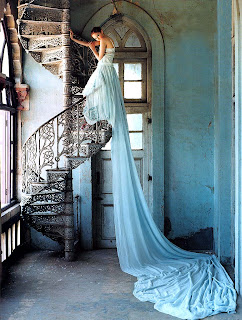
I think this photograph represents the rule of thirds, at first glance one would most likely notice he long evening gown cascading over the spiral staircase, and the eye is naturally drawn to the blue dress bunched up on the bottom of the floor. The image also contains framing, when looking closely the girl is framed in the long doorway behind her. If the photographer had not used those techniques the girl could have easily been lost in the blues and whites in the background of the photograph.
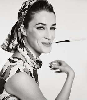
I love this picture for its vintage charm, the simplicity of the photo is what caught my eye and what was especially interesting to me is how elegant the model looked even while wearing a funky print, the picture remains so simplistic because nothing is in the photo that doesn't contribute the overall quality. Contrast is also an apprent technique used, the white background paired with the models dark features helps the picture to nearly pop off the page.
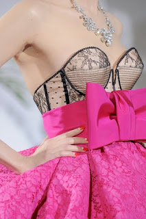
I saved my favorite picute for last, something about that dress, the bold colors just made me stop in my tracks. One of the main techniques I noticed was the use of subject background, it was blurred to draw the eye all the way down the picture. Another thing I noticed was contrast, although it wasn't the ordniary black and white contrast I am used to seeing, the hot pink and black really pops with the blurry white background


