Monday, April 19, 2010
please come summer
I found this picture on one of my favorite blogs 'Just be Splendid' and wanted to share the photo with everyone. I love the colors and how the dark mixes with the lighting in the photo to cast shadows. The photo makes me want to sit outside and drink cherry coke. Love Love this, enjoy!
GOOD BROCHURE
Since we have been working on brochures and design layout, I thought I would find an example of a brochure that really caught my eye. These examples are full of bright colors that all work together, with pictures and text, they made the brochures informative and fun at the same time. I really looked at these for inspiration when designing my brochure.What do you think?
Wednesday, April 7, 2010
FUNNY AD
I found this ad while flipping through a magazine a few months ago and I loved it. The line is simple and gets to the point which I think captures the vibe of the advertisement. There really isn’t much design but more of a concept, the ad evokes a light hearted feeling in its audience and the point of the ad was to get customers to want to drink water for its health benefits of ‘living young’ if a consumer drinks this product. Clearly, the water is the main focal point of the ad and while the ad easily could have been boring, Evian made it comical and cutesy to get a good laugh out of the audience while causing them to want to drink their product at the same time.
Monday, April 5, 2010
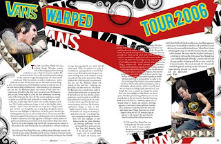
InDesign
We just started InDesign last week and so far I really like it, I've found that each new program becomes easier to use, which is always a plus! I started looking at some design layouts and I found one that I thought was really interesting. Although its pretty funky, I think it flows well together and is effective! ENJOY!
Subscribe to:
Posts (Atom)