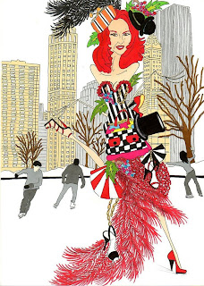
Since we have just started with Adobe Illustrator, I found a really funky picture I am going to try and replicate (eventually) once I learn more about the program. Hopefully with LOTS more practice I will be able to create interesting fashion photos all on my own!
Monday, February 22, 2010
Thursday, February 18, 2010
Good/ Bad Typography analysis
File name for bad example: badexample
Source of example: http://ttebyu.pbworks.com/Typography
Elements of design exhibited: Although I understand that this ad is trying to make the audience feel crammed, I think it was done poorly. The font used is not appealing to the eye, and becomes hard to read when squeezed together in that manner. There is simply too much going on to be affective, if the letters were spaced out more I think this ad could have been much better.
Who is the target audience? The target is for people who don't have ideal office spaces and this ad is trying to give people an oppourtunity to have the chance of getting an office that is spacious and comfortable.
File name for good example: goodexample
Source of example: http://www.designflavr.com/Squeeze-da-ideas-Stefan-Chinof--i956/
Elements of design exhibited (or not exhibited): The design displays movement and is fluid, the words flow together with the colors used, and the white font is easy to read next to the black and colorful background.
Who is the target audience? The target audience for this design are customers for interested in graphic design
Monday, February 15, 2010
Tuesday, February 9, 2010
Love it
I love everything in this picture. Normally 20's fashion isn't one of my favorite eras, but im really appreciating this, especially those rings. How does it relate to our assignment you ask? I just really thought that the placement of the pictures, although random looks really good. Also, I since we have been working with photoshop lately, I figured this was probably created using photoshop, either way, I love the picture and I think im going to try and replicate it for my catalog cover.
Tuesday, February 2, 2010
Wish I Was Here
After getting our last assignment about creating a postcard, I couldn't stop thinking about how badly I wanted to go to Bora Bora. This picture is so pretty, with the aqua water, hot pink flowers and orange sky. Although I was mainly looking at the beauty in the picture, I also noticed the rule of thirds, and couldn't help but think that not only is the picture awesome but uses various photogrpahy elements as well. Enjoy!
Subscribe to:
Posts (Atom)